Santa Maria Valley
Visual Identity, Web Design, Design System, Email Design, SocialSanta Maria Valley sits between Los Angeles and San Francisco, close enough to both that most people drive right past it. That was the problem. A destination with award-winning wine, serious barbecue, and year-round outdoor access had a website that hadn't been touched in over a decade.
We partnered with the Santa Maria Valley team to rebuild it. A site that could actually do the work of turning a curious visitor into someone who books the trip.

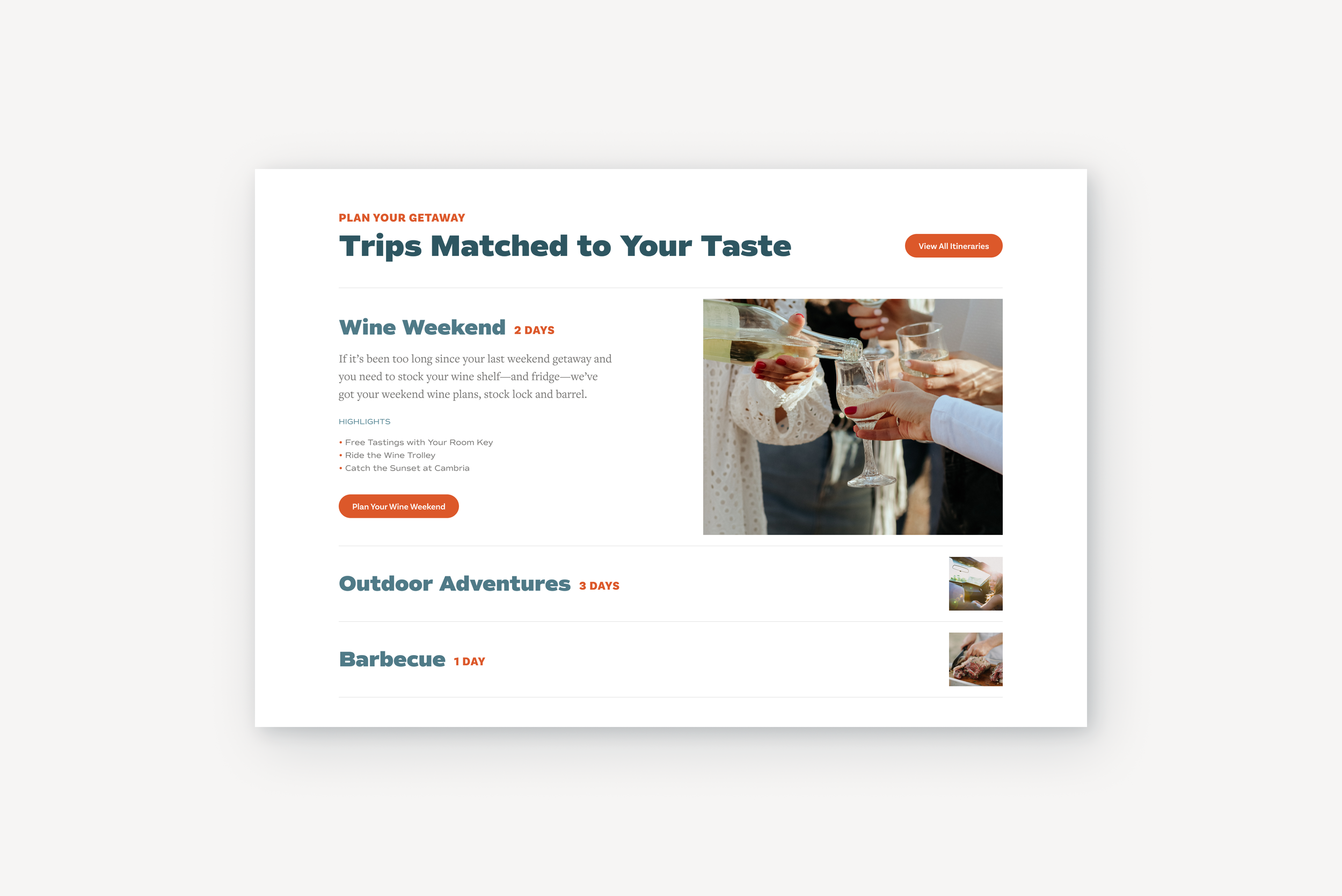
Plan your getaway
Part of what makes Santa Maria worth visiting is that not everyone knows it yet. The wine is just as good, the trails are just as long, and you're not fighting for a reservation. That feeling of being in on something was worth protecting in the design.
The site was built to let visitors explore rather than present everything at once. The itinerary section is a good example. The expanded state gives a featured trip room to tell its story. The collapsed rows stay lean: a title, a duration, a thumbnail. Enough to prompt curiosity without making the decision for them.
The range in trip length was intentional too. One day to three days covers a day tripper and a long weekend visitor in the same module, without the site having to explain itself.
It's always hiking season here
The image and text layout is the workhorse of the site. It needed to carry every content category without feeling repetitive. The structure stays consistent across a strong headline, supporting copy, and a clear action. What changes is how the brand shows up around it.
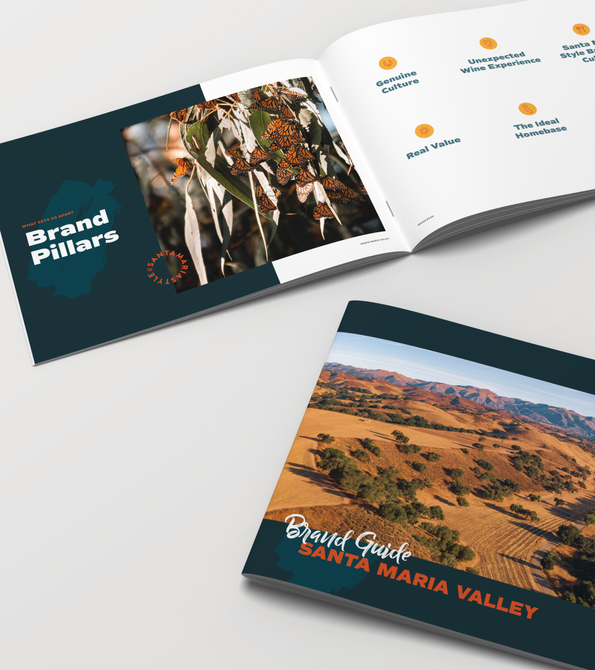
The hashtag badge was something I introduced on this project, designed in close collaboration with the social team who were actively pushing the hashtag as a campaign driver. Rather than treating it as a logo alternative, it became a compositional tool that bridged the website and social channels. Placed at the intersection of white space and photography, it adds energy to the layout while reinforcing a call to action the whole team was behind. It carried forward into the email campaigns and brand book, becoming one of the defining visual signatures of the updated brand.
The dual CTA reflects two different visitor mindsets in one line. The filled button is for someone ready to go. The text link is for the planner who wants to take something home first. No second section needed.

What's happening in the valley
Tourism sites tend to overload news sections with competing images, mismatched photography styles, and equal visual weight across every post. It gets unfocused fast. The recommendation here was to feature one story with a photo and let the rest live as clean headlines.
The client trusted that call. The result is a section that feels edited rather than dumped. One image does the visual work. The headline list keeps the page moving without the eye getting lost. "More to Discover" at the bottom is a soft invitation rather than a hard sell, consistent with how the rest of the site handles CTAs.

A template built to flex
The secondary page hero had to work across every content category on the site. A long headline for one page, a short one for another. Photography that changes every time.
The main hero taught us something early: floating text over a full-bleed image creates fragile layouts. Line breaks become a problem. Contrast becomes a problem. The secondary hero solved for that by separating the image from the copy entirely. The photo gets the full width uninterrupted. The content below has room to breathe.
The paint texture under the headline is a reworked version of a texture from the original site, stripped back to feel fresh without losing the brand's handmade quality. It grounds the text without competing with the photography above it. The two column split gives the headline and body copy their own lane.

A system built for the valley
The old site leaned heavily on kraft paper texture and a muted palette. It had character but it was working against the destination. Santa Maria has world class photography to pull from. The refresh made images the hero and let texture play a supporting role.
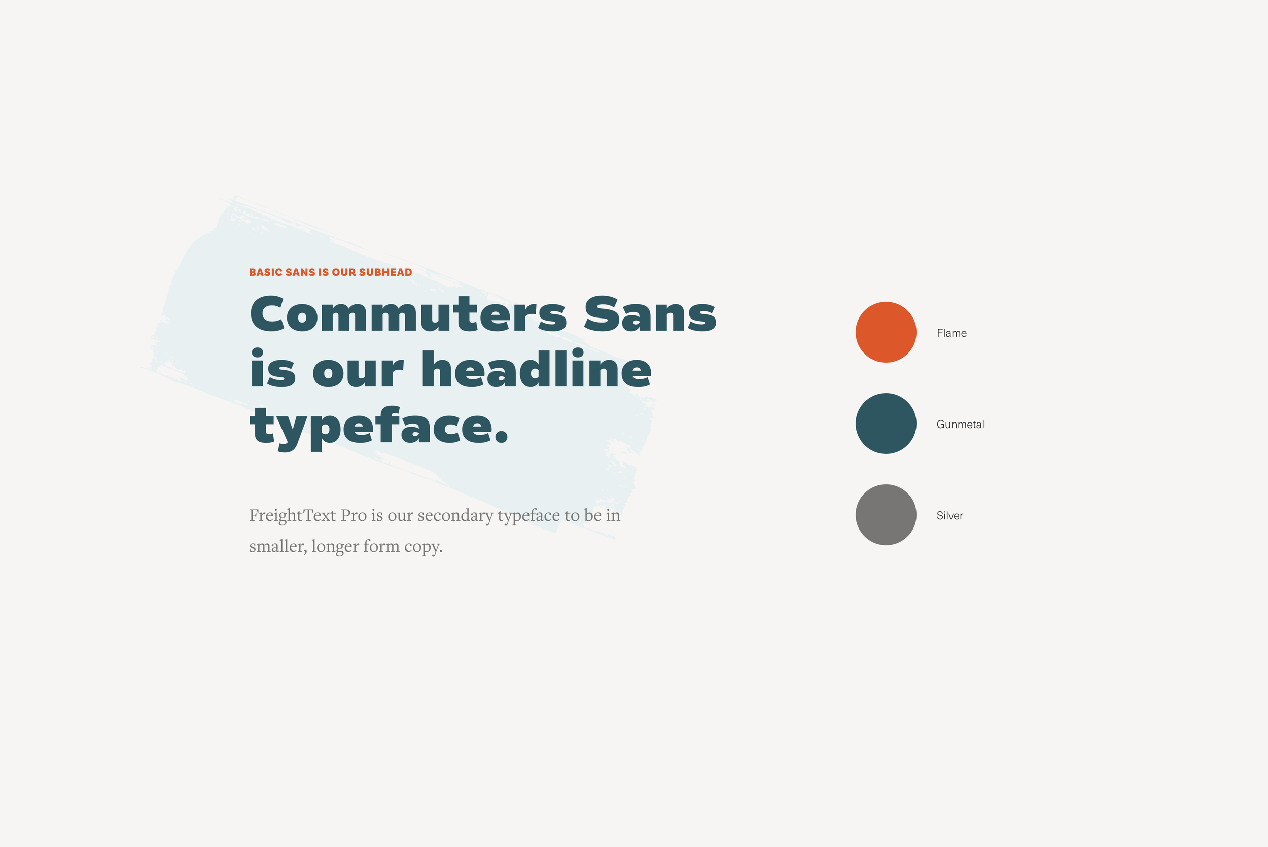
The palette stayed. Flame, Gunmetal, Silver. What changed was how they were used. Color became a signal rather than a background, showing up in CTAs, category labels, and type accents rather than washing across entire sections.
The type system was built from scratch. Commuters Sans handles headlines, bold and wide enough to hold their own against full bleed photography. FreightText Pro handles longer body copy, adding a warmth that a second sans wouldn't. The display script used across category cards and section headers brings the human element. Three typefaces is one more than I'd normally reach for. Four was a conversation with the developers. It became a long standing joke that most sites are built with four typefaces. But each one has a clear job, they work together, and I'd make the same call again.
Brand in motion
Santa Maria isn't precious about itself. The category cards reflect that. Script and all-caps type layered over photography, informal and direct at the same time. The overlap creates depth. The arrow moves you forward.
The event card reflects a different priority. The client updates this section more than anywhere else on the site, so it needed to be bulletproof. Every component was built with variations that work cohesively regardless of how they're combined. The hashtag badge floats to different corners depending on the layout, keeping it feeling spontaneous rather than stamped. A content editor can swap a photo, update a date, and change a headline without breaking anything. The design system does the heavy lifting so the client doesn't have to think about it.

Designed for every screen
The mobile views weren't an afterthought. Desktop and mobile were designed and presented together, ensuring every decision made at full width translated cleanly to a smaller one. The accordion stacks naturally, photography crops to its strongest moment, and the type stays large enough to lead.
The lodging section came with a real constraint. Hotels and accommodation partners are significant funders of Santa Maria Valley tourism, which meant the design couldn't visually favor one property over another. The solution was a list format with circular thumbnail photos and a dollar sign pricing system. Each property gets equal visual weight. The pricing gives visitors a useful signal without the site appearing to editorialize. Everyone stays on equal footing.

Beyond the website
The site became a foundation the client could actually build on. Because every component was designed with content management in mind, the team could keep the site current without needing a designer in the room. Fresh content gave the email campaigns somewhere worth sending people. Social posts had a destination that reflected the brand they were building.
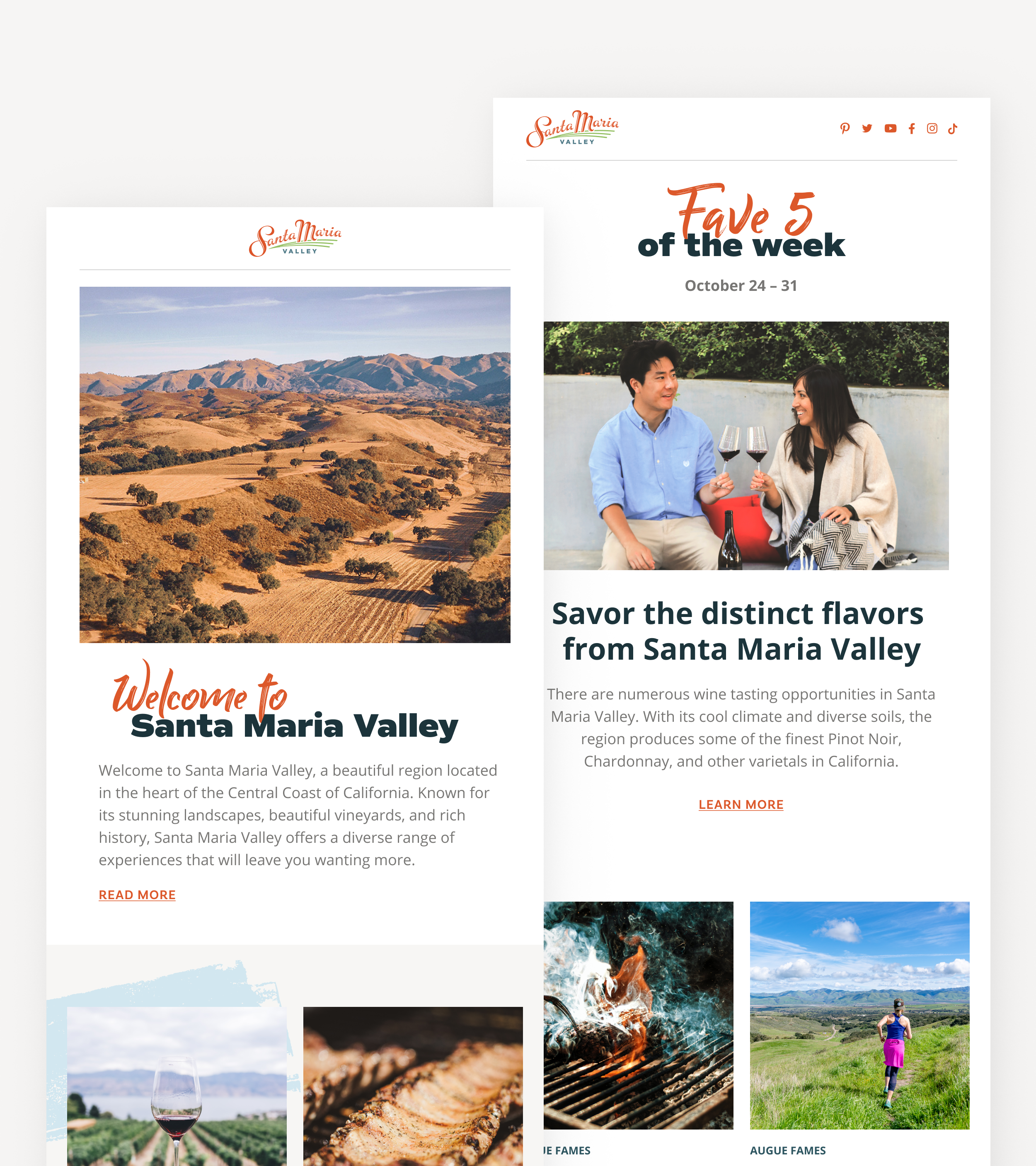
The design language carried forward into a brand book and a recurring email series. What started as a website project became the visual foundation for how Santa Maria Valley shows up across every channel. That's the outcome worth designing toward.